When we – the Atmosphere management with me, Adam, as the new dive center manager – sent our beautiful dive vessel Victoria to her yearly dry dock, we decided on some drastic changes…
If you have been to the Philippines, then you will no doubt have encountered their traditional style of boat – the banka. This might conjure up images of wealth and prosperity but in this case, it is more about simplicity and ergonomics.
A banka has a single hull supported by outriggers on either side which are usually made of bamboo but sometimes solid wood depending on which region the boat is built.
(Here is Victoria BEFORE dry dock:)
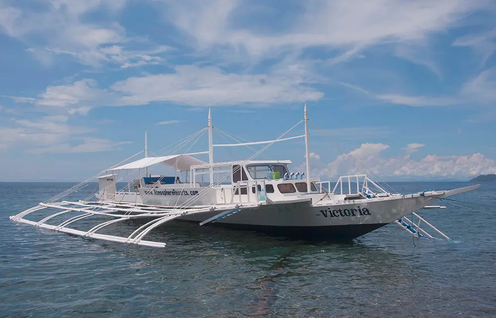
Victoria – before dry dock
For now, I shan’t bore you with the many different styles and design attributes of solid versus semi-flexible outriggers although, sad as it may be, I would gladly do so in the future! Bankas are generally powered by diesel truck engines which only enrich the individual character of each boat. In order to keep these boats at their best we dry dock our boat – Victoria – each summer to maintain and upgrade various components.
This year, as well as a few standard repairs, we decided on a new paint scheme for the boat. Traditionally, bankas are almost always white, at least in our region.
Naturally, the scheme was going to take its influence from the Atmosphere Resorts colour scheme of dark blue with white. The management team decided to emulate the classic ocean going liners, however, not Titanic (!) in order to evoke the luxury of yesteryear. “Not too difficult” I hear you say. Sadly, precision engineering and in particular, typography, are not common skills in the Philippines. On the other hand, someone always has a relative who claims to be proficient in the desired area. This was no exception…
Having seen some of the slightly avant garde hand painted signs around Dauin and Dumaguete, I decided to leave nothing to chance and made a series of templates for the exact size, font, colour and position of the lettering while Troy, our calligraphic knight in shining armor with his air-brushes and copious amount of masking tape was able to turn ideas into perfect results. (I also promised Troy I would put this picture on the internet!).
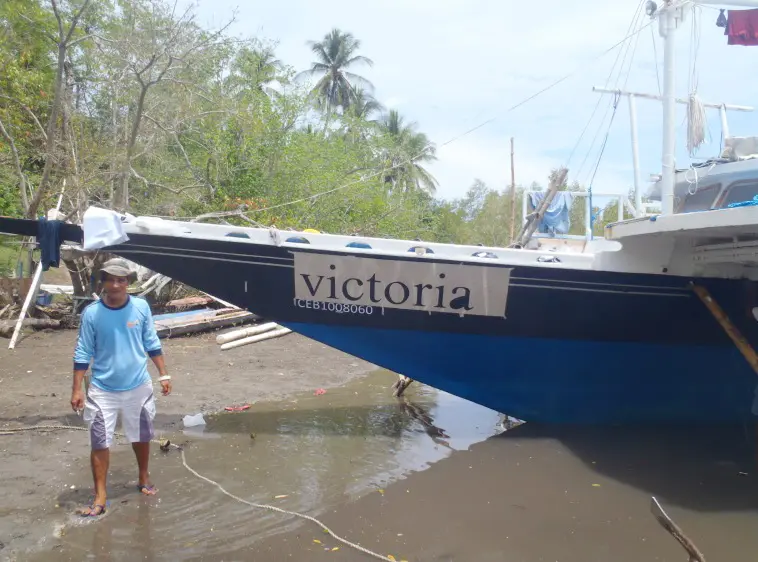
This is Troy, the creative sign painter…
I think you will agree that Victoria now looks incredible (top photo) and the new unique paint scheme definitely helps her stand out.
/Adam


